Sketch of a utensil dispenser Sketch of a utensil dispenser

🥯

Responsive Redesign for Bagel Gourmet

Assignment 2, Oct 4th - Oct 18th

Lo-fi Wireframing

Introduction

For this assignment we were tasked with redesigning and coding one page of a website while keeping accessibility and responsiveness in mind. I chose to redesign Bagel Gourmet's wesbite since it is one of my favorite resturants in Providence and the website hasn't been updated in many years. The food, workers, and physical restuarant location are top notch and I want to make sure that their website reflects that too.
Original Website

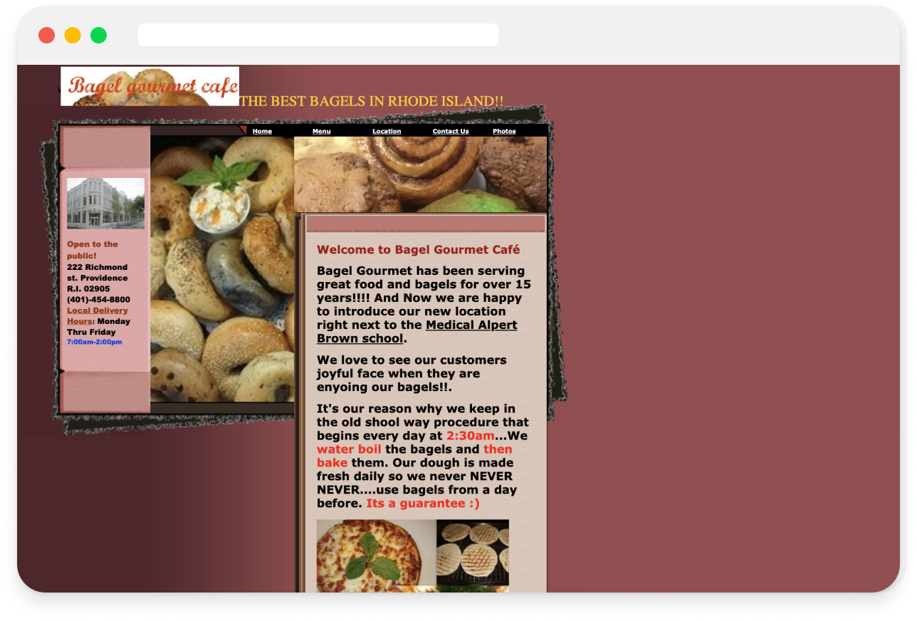
Bagel gourmet's original website. Maroon background and white text. http://bagelgourmetcafe.com/

The original website has very outdate information and design. Overall the text is cluttered, the colors have low contrast, and the images are all layered over each other. Let's take a more in-depth look at the user pain points.

Pain Points

Learnability and Usability Issues

  • The sizing and boldness of the fonts do not follow a consistent heirarchy.
  • There are multiple focal points competing for attention and generally not visually engaging.
  • Too many different text colors and fonts.
  • The images are cluttered and layered together.
  • Very cluttered on the left and a lot of whitespace on the right side.
  • Some things that are underlined denote a link, but other things that are underlined are not links.

Conceptual Model

  • This is a wesbite landing page for a resturant and it roughly follows the general conceptual model that people have for these types of websites: there is the nav bar a the top and a description of the website with some photos under that.
  • However, the places where it says hours is very confusing because it only includes the hours that they are open for delivery but not the hours that the store is actually open for. Making it very confusing to me what the target audience of the website is.
  • Additionally, you can also place orders on the website, but that isn't advertised or apparent on the landling page, you can only tell if you click into menu nav link.

Accessibility Problems

  • The color contrast on some of the text is very low. For example, the bright red text on the cream background is pretty low contrast and the red curisive on the logo blends into the brown background of the bagels.
  • The menu bar buttons have a very small touch area and the font size is small.
  • None of the images have alt text for visually impaired users.
  • The headings also do not follow the H1, H2, etc. html tags.

WebAIM WAVE Accessibility

The WAVE accessibility tool revealed issues that I had mentioned about such as empty alt text, inconsistent type heirarchy, small text, and low color contrast. But there were a couple issues that I didn't catch such as not defining a language in the head of the html and there were a couple empty heading tags.
Lo-fi Wireframing

Lo-fi Wireframing

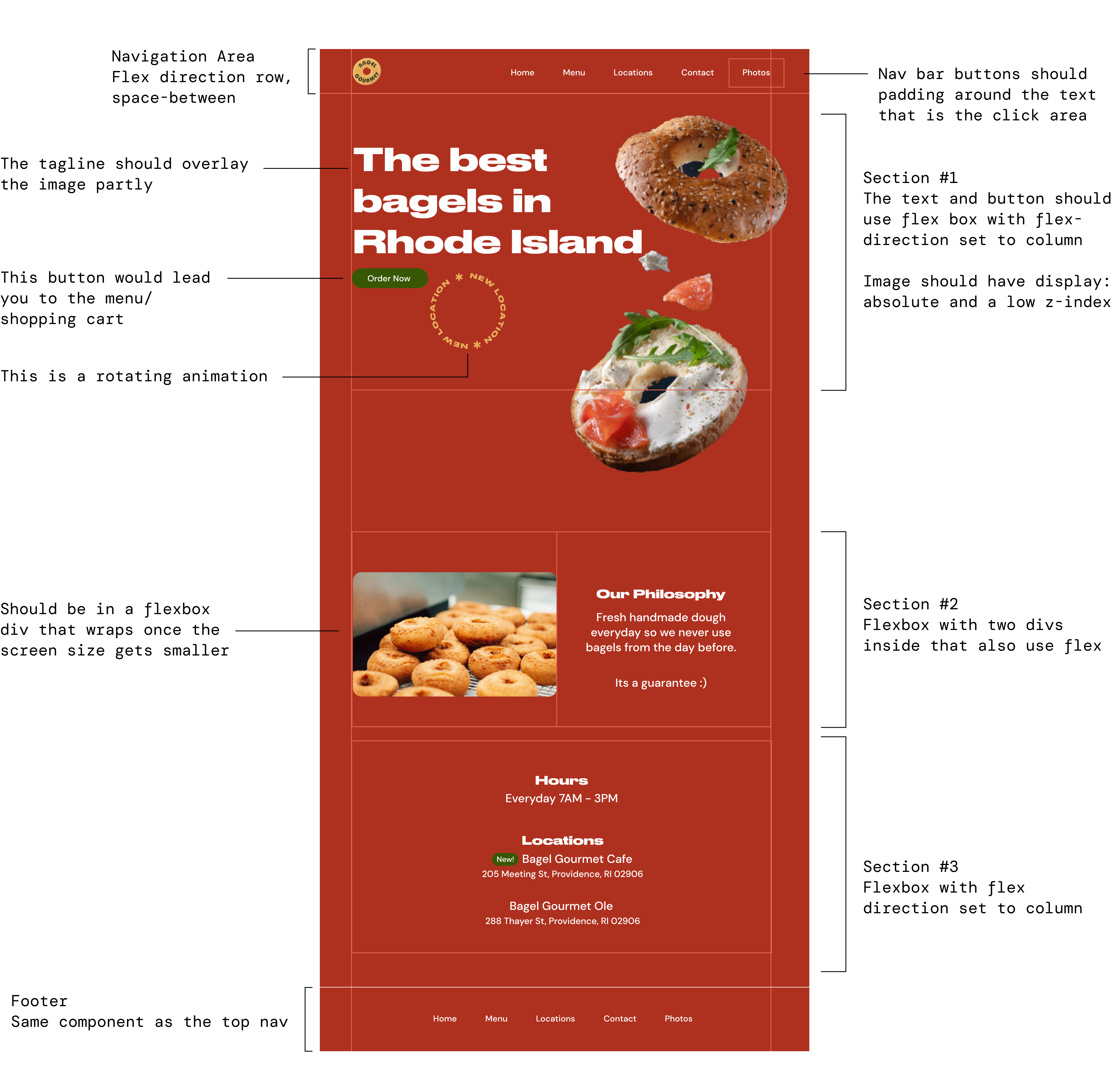
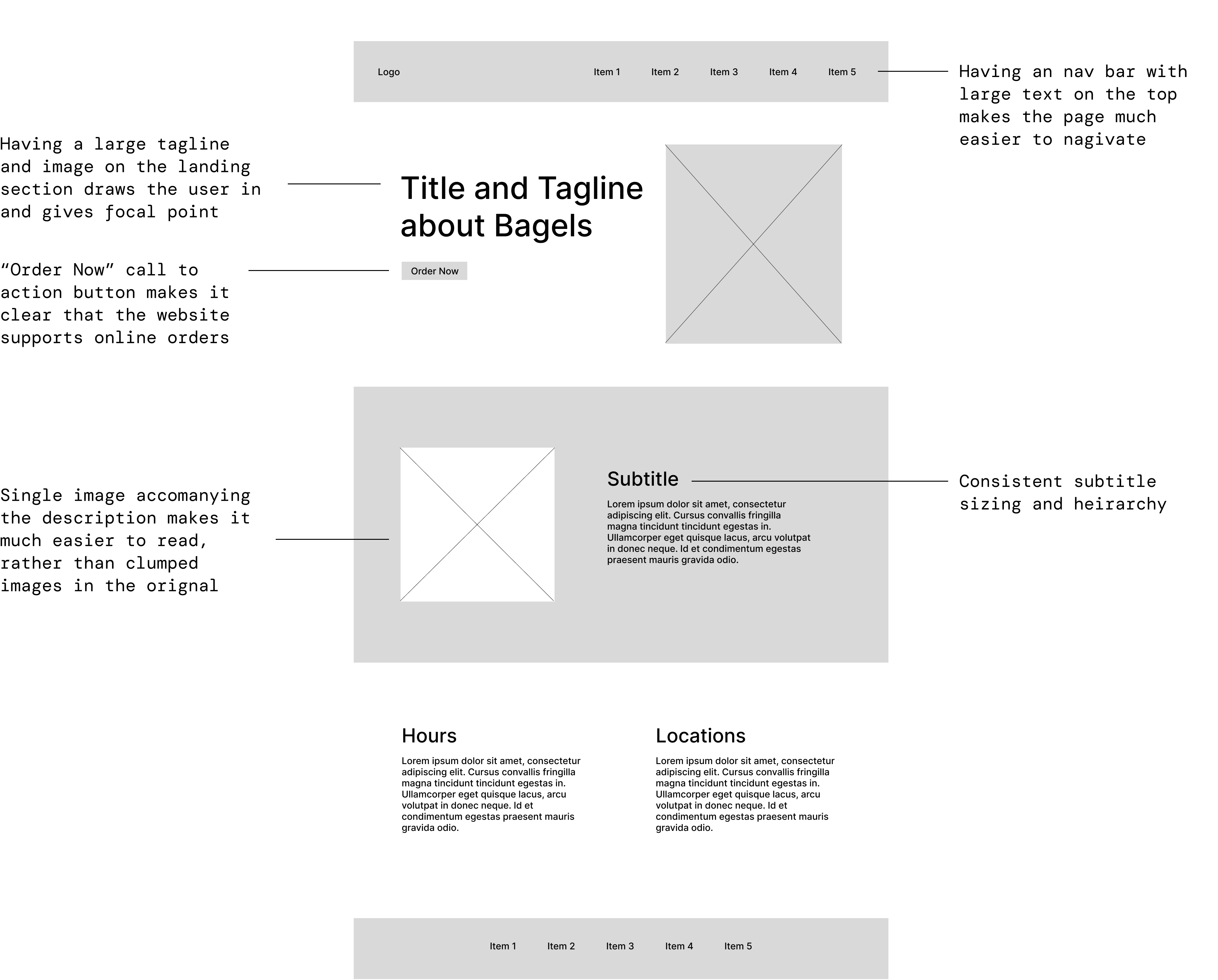
I wanted to keep generally the same informationand content as the original page, but change the layout to be much more clean and organized. I added three separate sections: the landing section, description of the restuarant, and then information on hours and locations.

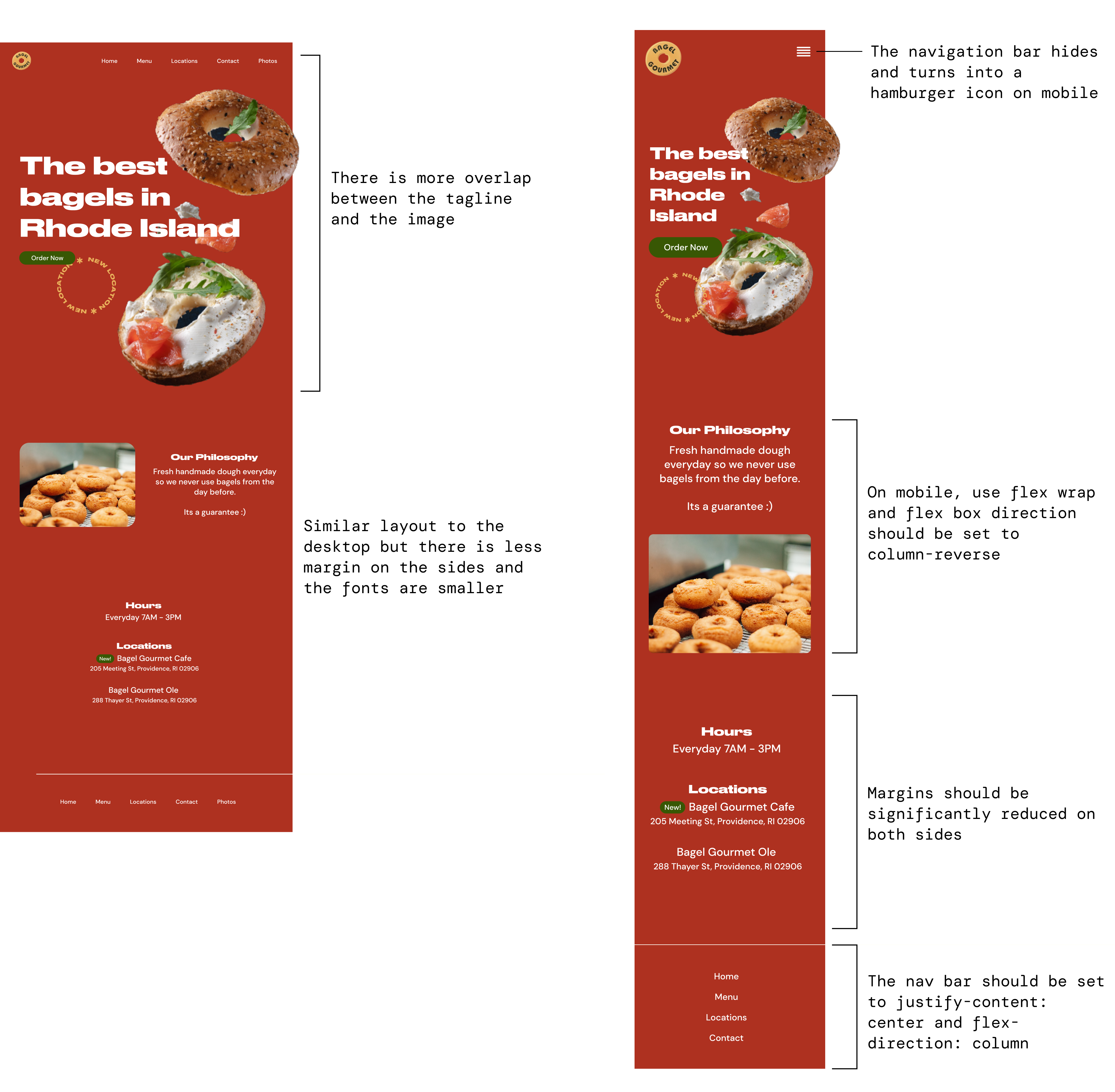
Below is the lo-fi wireframe for all three screens and shows how the layout would be responsive.
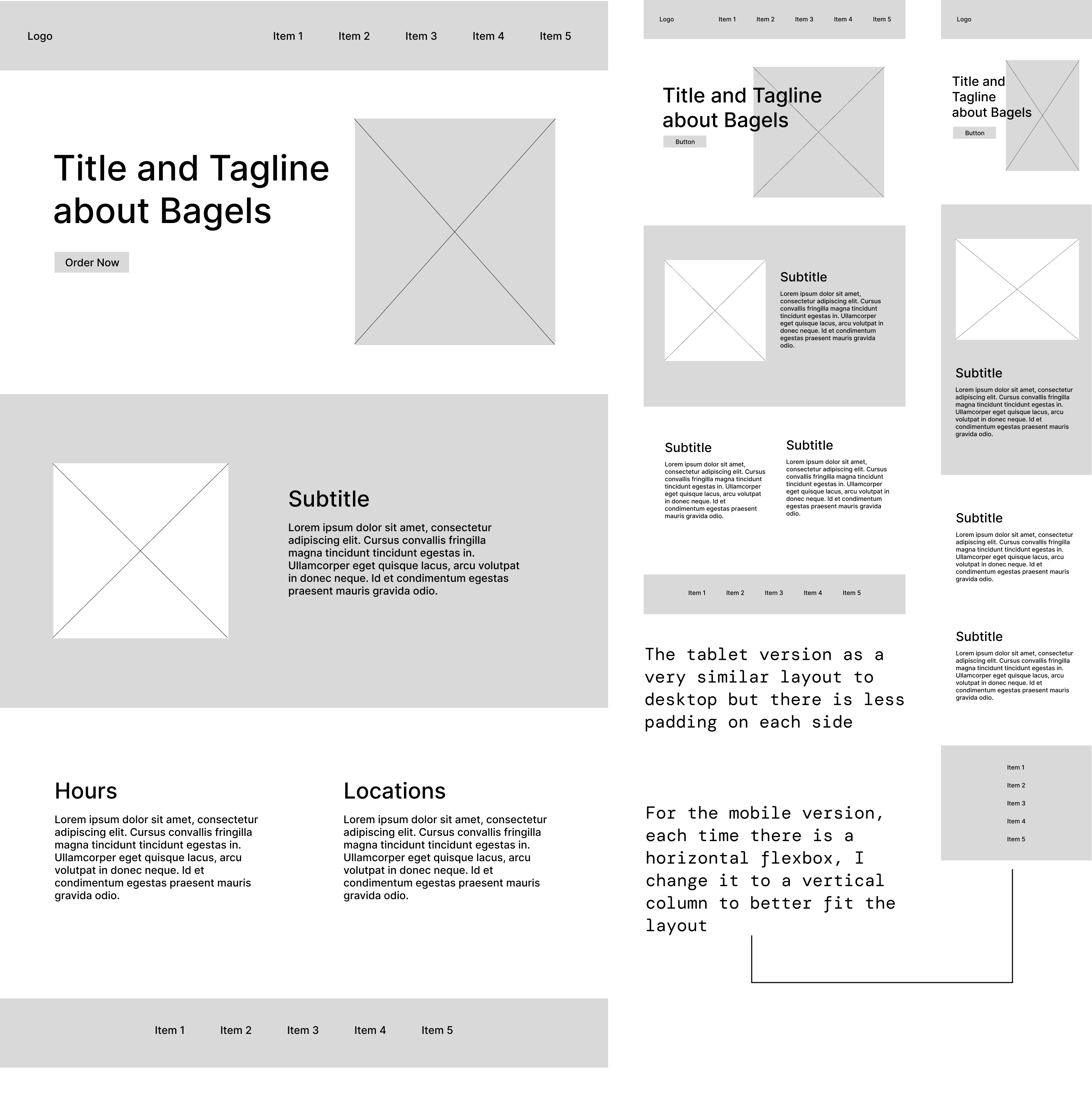
Lo-fi Wireframe for redesign.

Style Guide

In my style guide I included fonts, colors, and all the reusable components I had in my design. Since my the orginal website doesn't have a lot of content on the main page, I also don't have many interactive elements other than buttons and the nav bar.
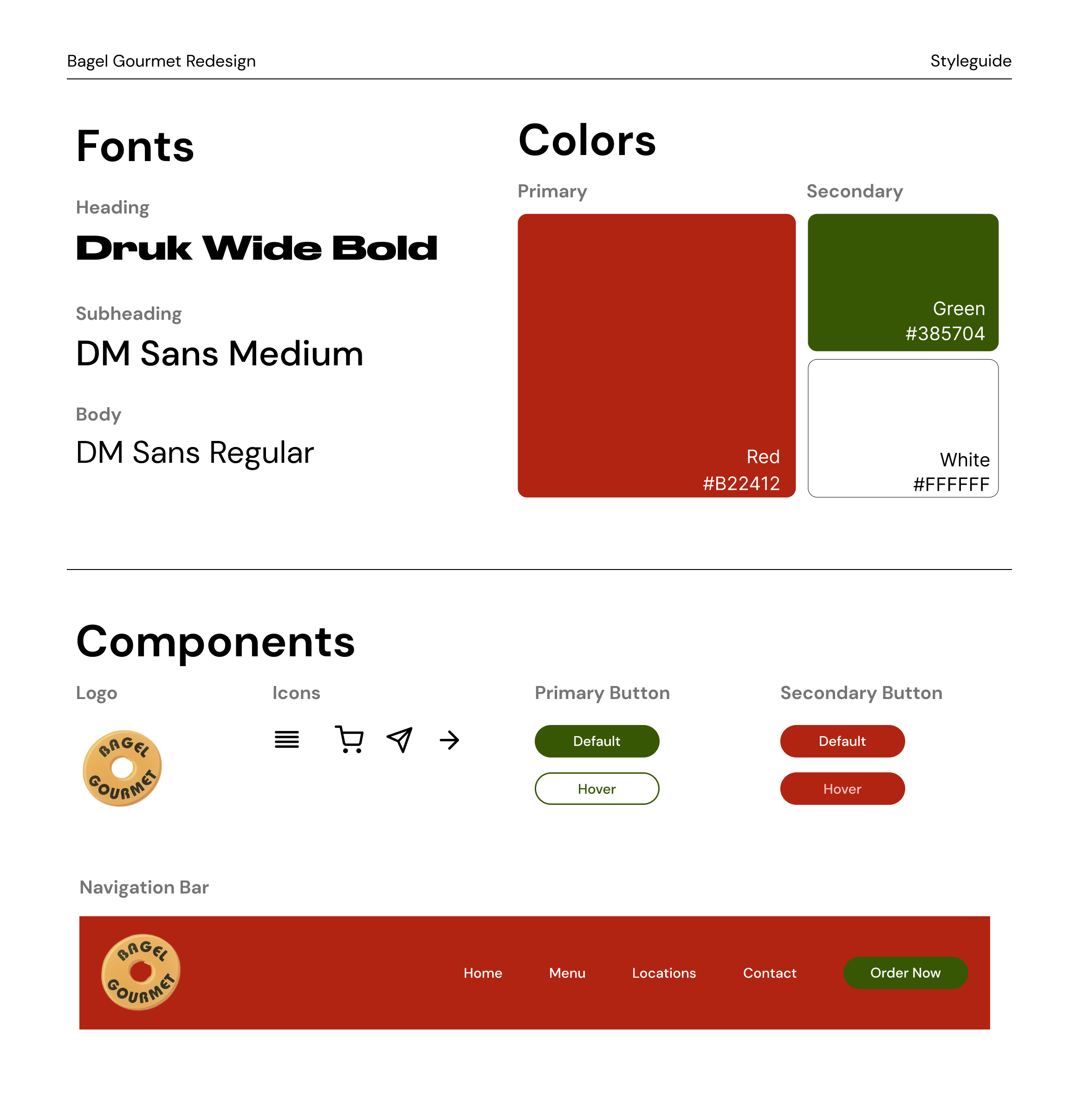
Styleguide for new wesbite made in figma.

Hi-fi Prototyping

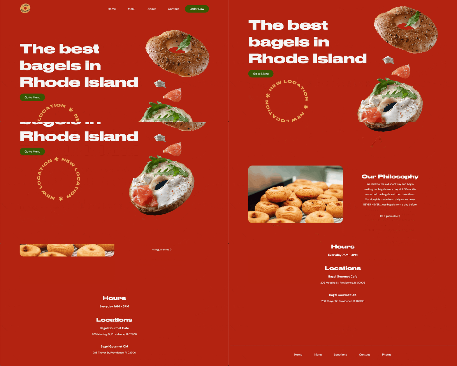
Desktop

Hi-fi Wireframe for redesign.

Tablet and Mobile

Hi-fi Wireframe for redesign.

Final Design

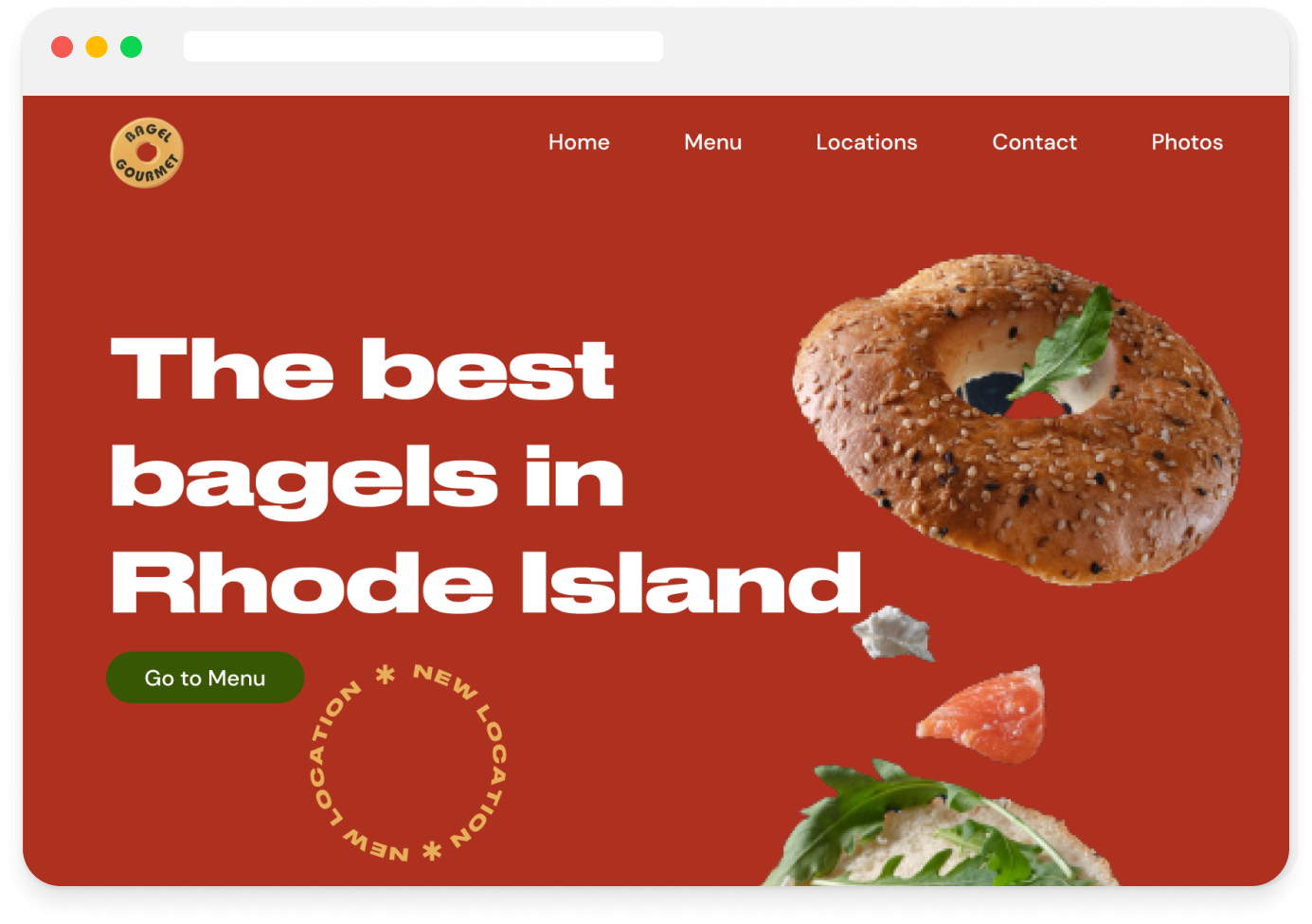
Here is the final product! My website is linked below if you want to check it out and play around with the responsiveness.

https://shyrhino123.github.io/bagel-gourmet-redesign/ Final screenshot of redesign.