

Iterative Design is a project we have done as a part of our CSCI1300: User Interface and User Experiences course at Brown University. Our task was to design an interactive interface for an emerging startup, going through the full process of mocking up a solution to the startup's concept. We chose hello as our startup.
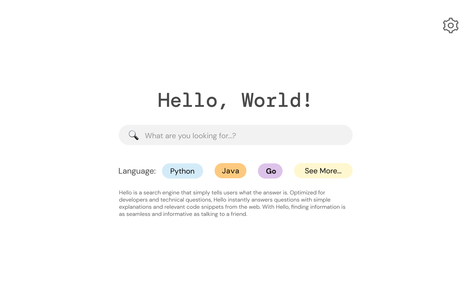
Hello is a search engine that is optimized for developers and technical questions. It answers questions with simple explanations and code snippets from the web instantly. Hello uses Ai language models to quickly generate answers based on multiple resources.
The intended audience of hello consists of developers and computer science students/ professionals. They can use hello to receive fast answers to their technical questions. Because of the coding nature of the startup, we chose to design a desktop interface.
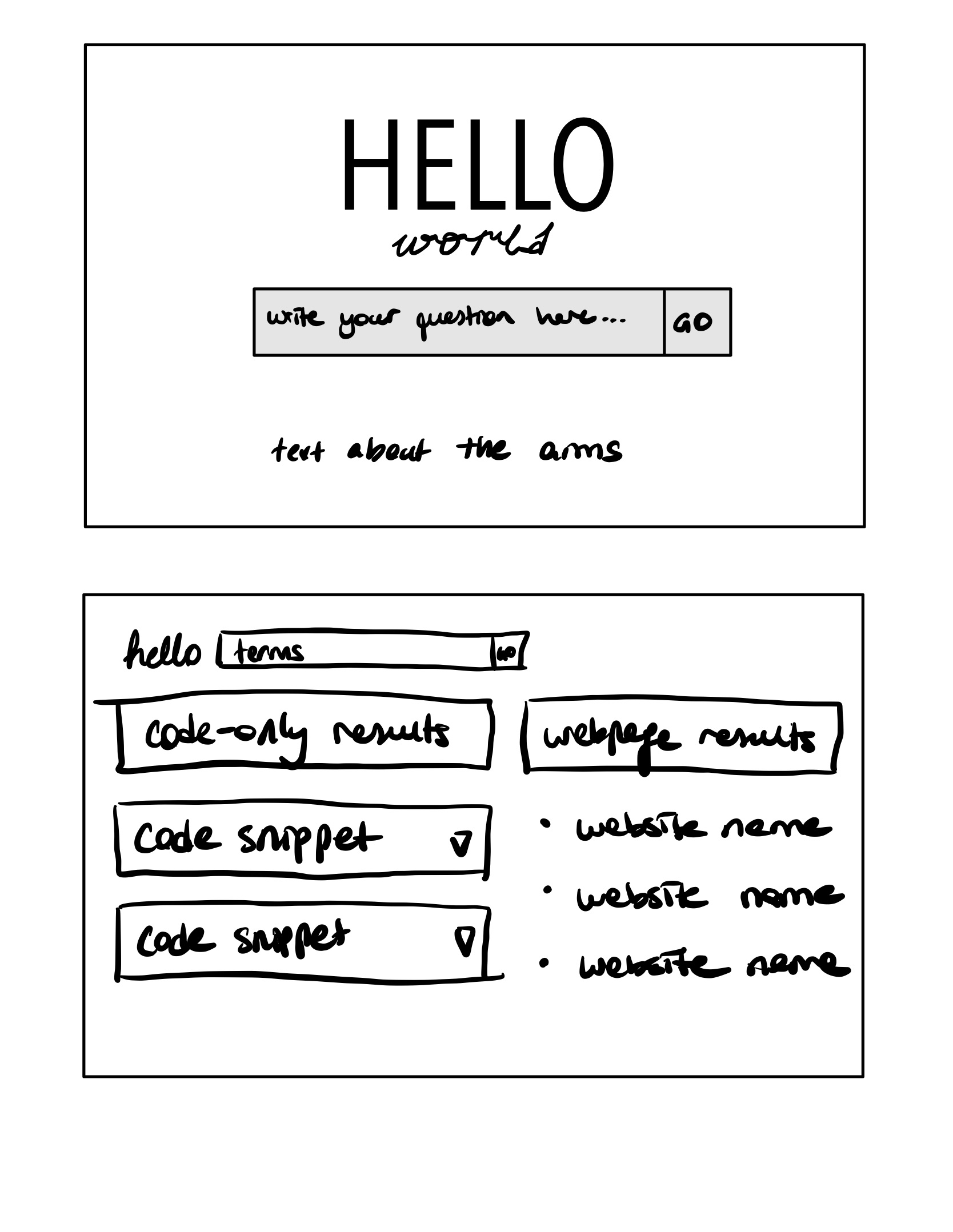
To get the ideas flowing, our group made some quick hand-drawn sketches. We came up with four different possible designs for our startup’s design.
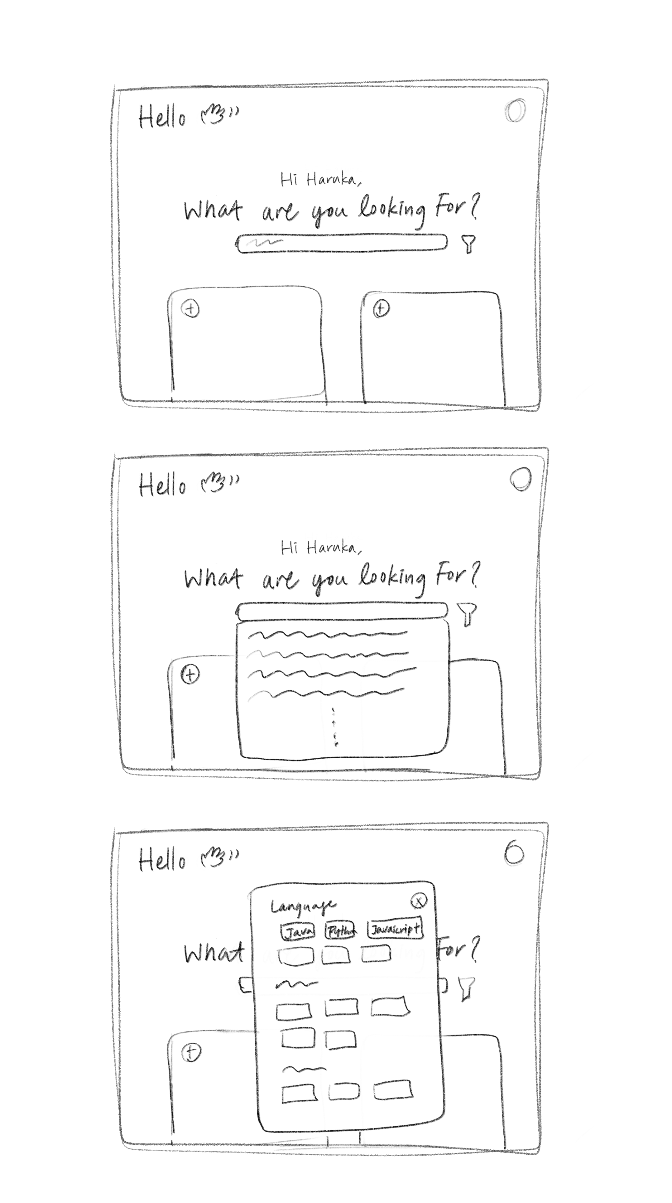
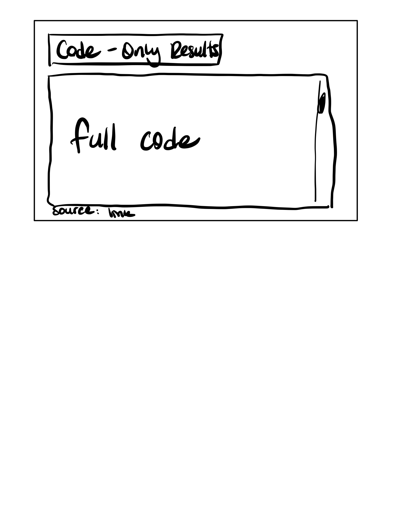
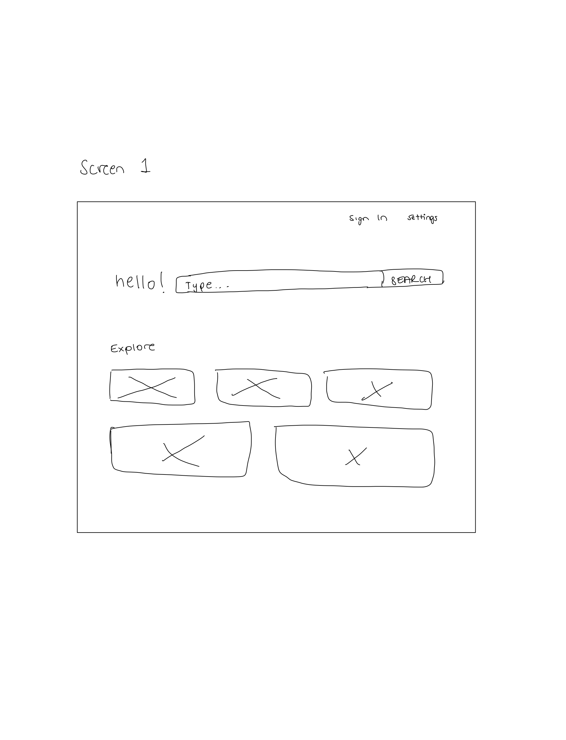
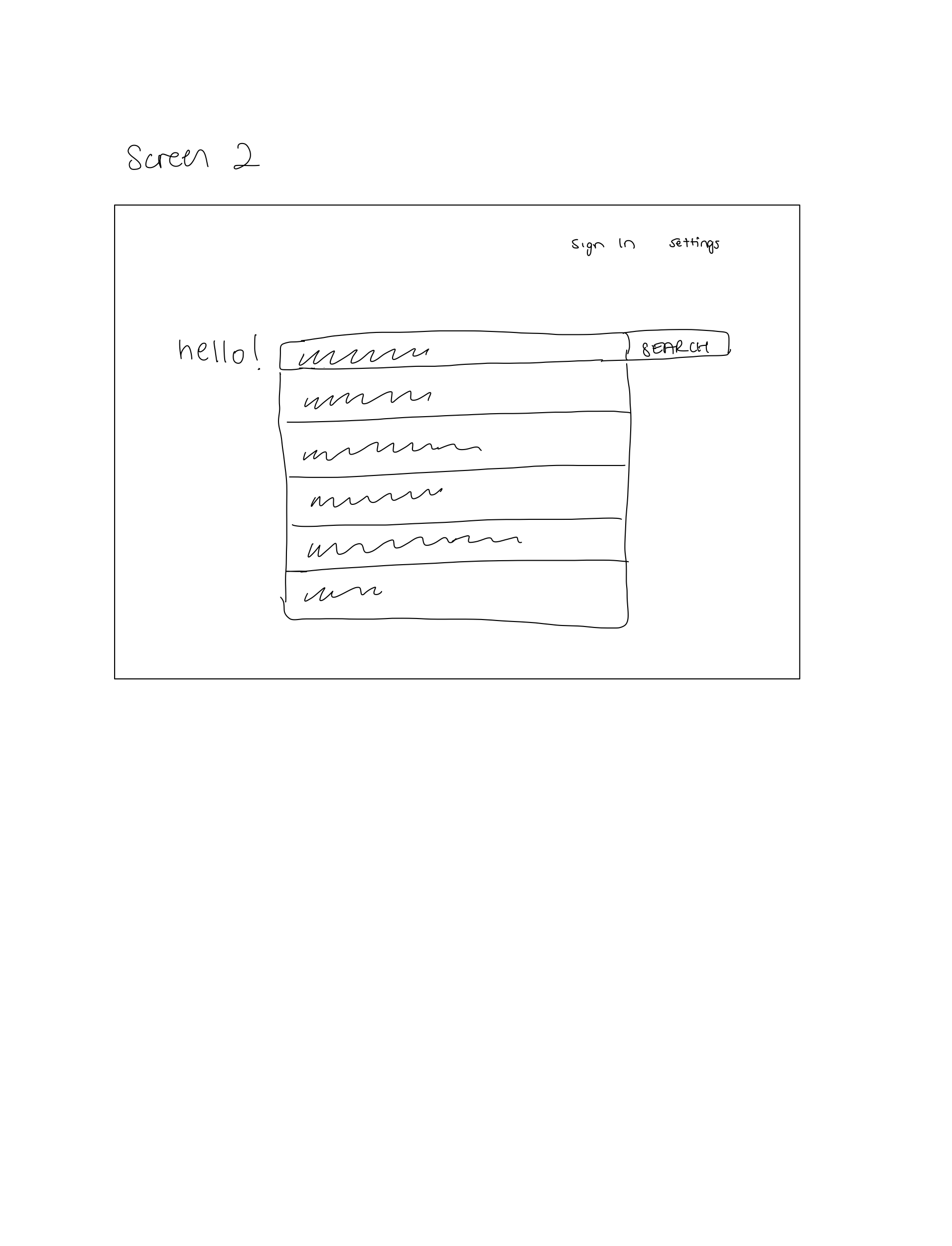
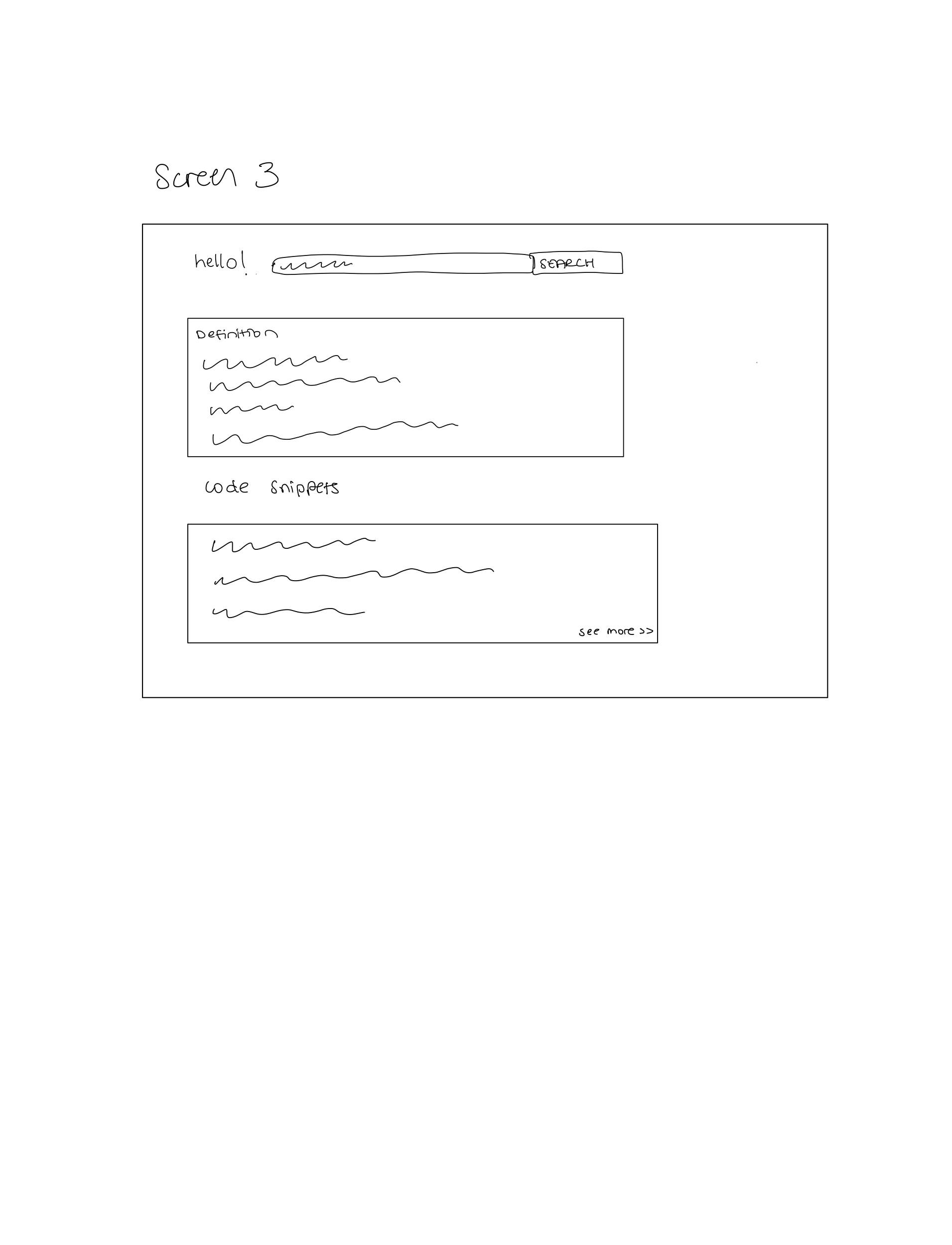
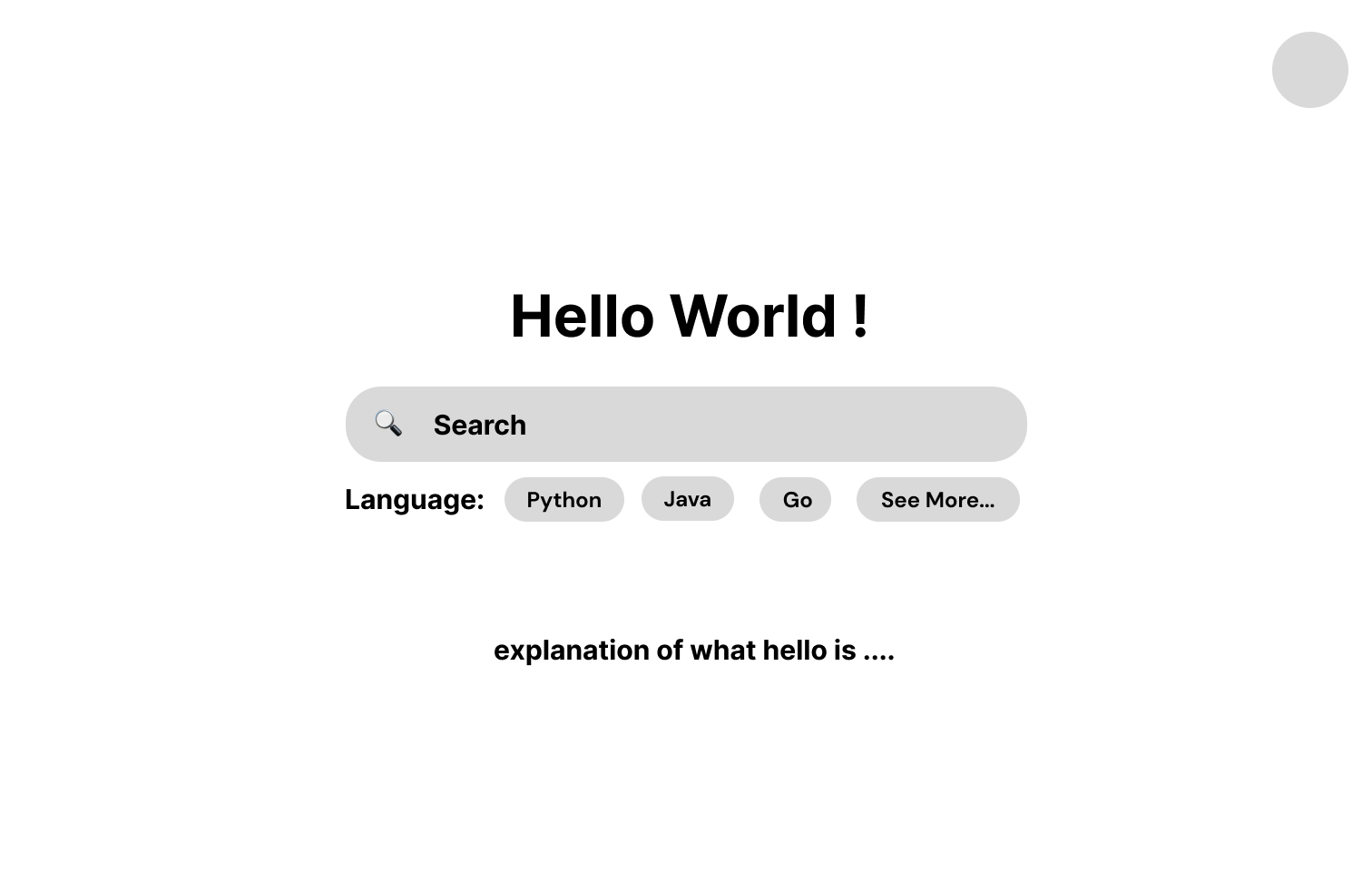
After the initial sketching, we came up with a new design to demonstrate our startup company's goals in the best way possible. We wanted our design to be simple, intuitive, and easy to use. We choose the split screen design to provide all the tools necessary for the developers. Furthermore, we wanted a clean yet unique look, which separated our startup’s project from other search engines available. Below is a low-fidelity wireframe of our design.
.png)
.png)
.png)
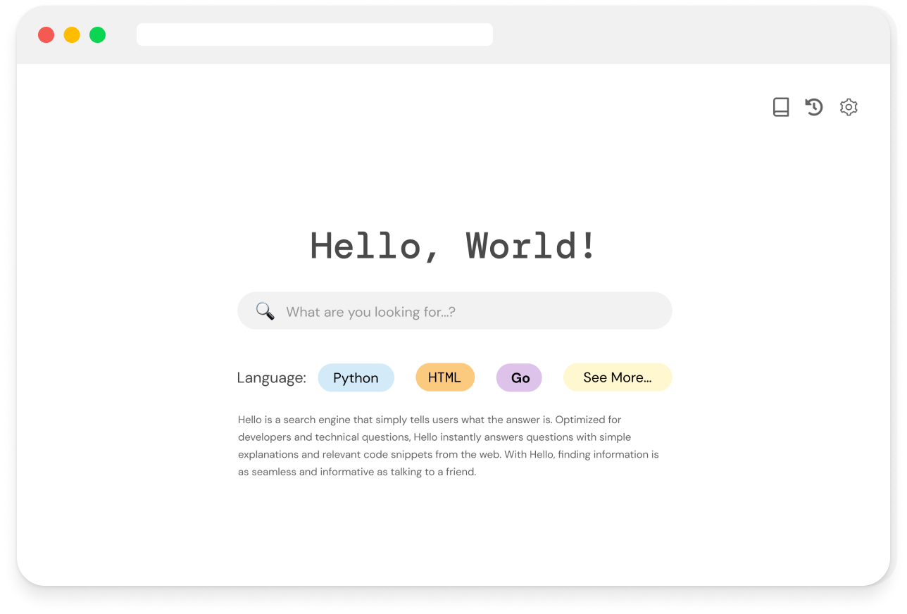
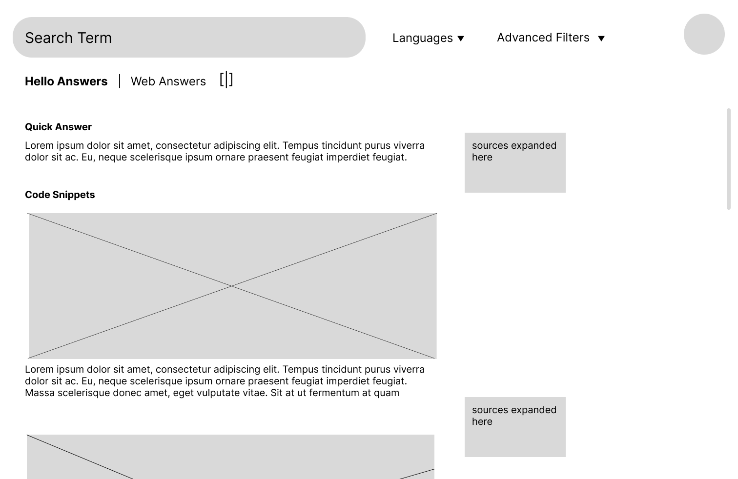
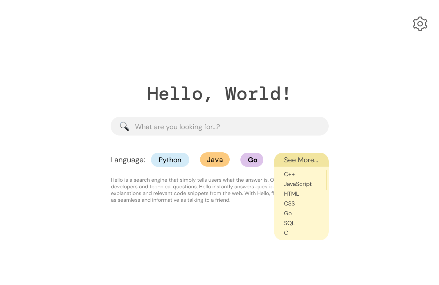
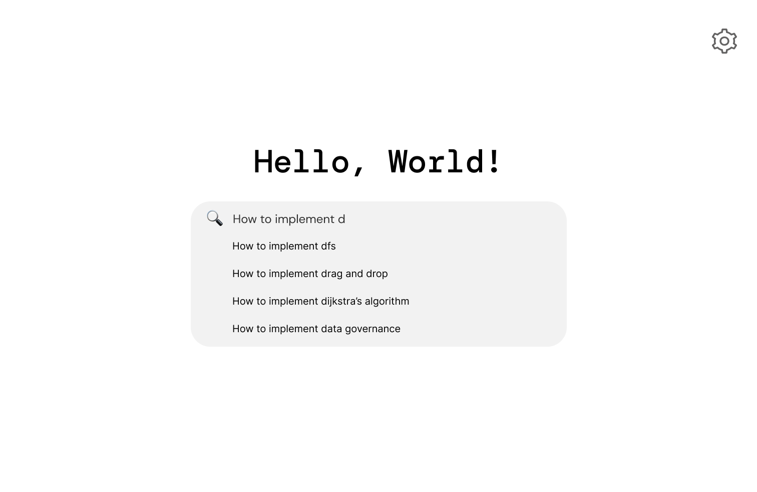
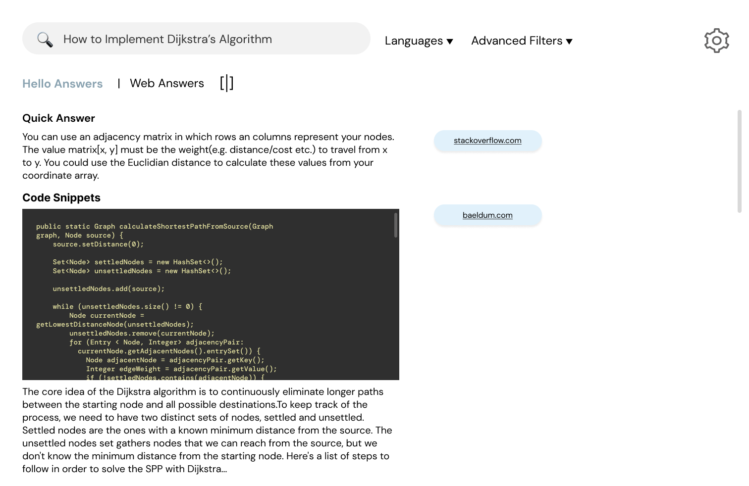
Using Figma, we created an interactive high-fidelity prototype. While making our design, we choose a clean look with minimal distractions. We chose our fonts to reflect the startup's technical nature. We paid special attention to text hierarchy and color scheme to make our page easy to read and navigate. By using contrasting colors, such as black text on a blue background, we made the font more visible so that anyone could read the website. We chose to use icons on our website to express possible actions, such as bookmarking and history, to grab the user's attention and help the users find the content they are looking for. We made sure to use icons that the user can easily understand. We added a split screen option for users to view ‘Web Answers’ and ‘Hello Answers,’ which are generated simultaneously by hello’s AI algorithm.
.png)
.png)
.png)
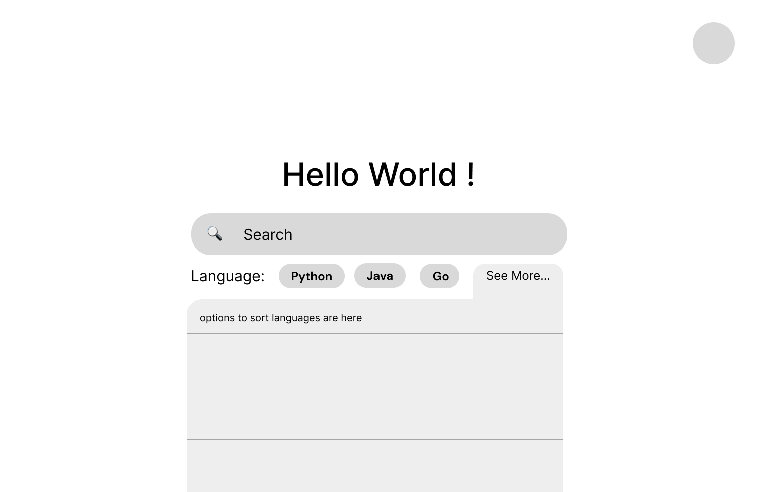
During Studio time, we asked for peer critiques to identify potential problems with our high-fidelity mockup. Below are some issues that were identified:
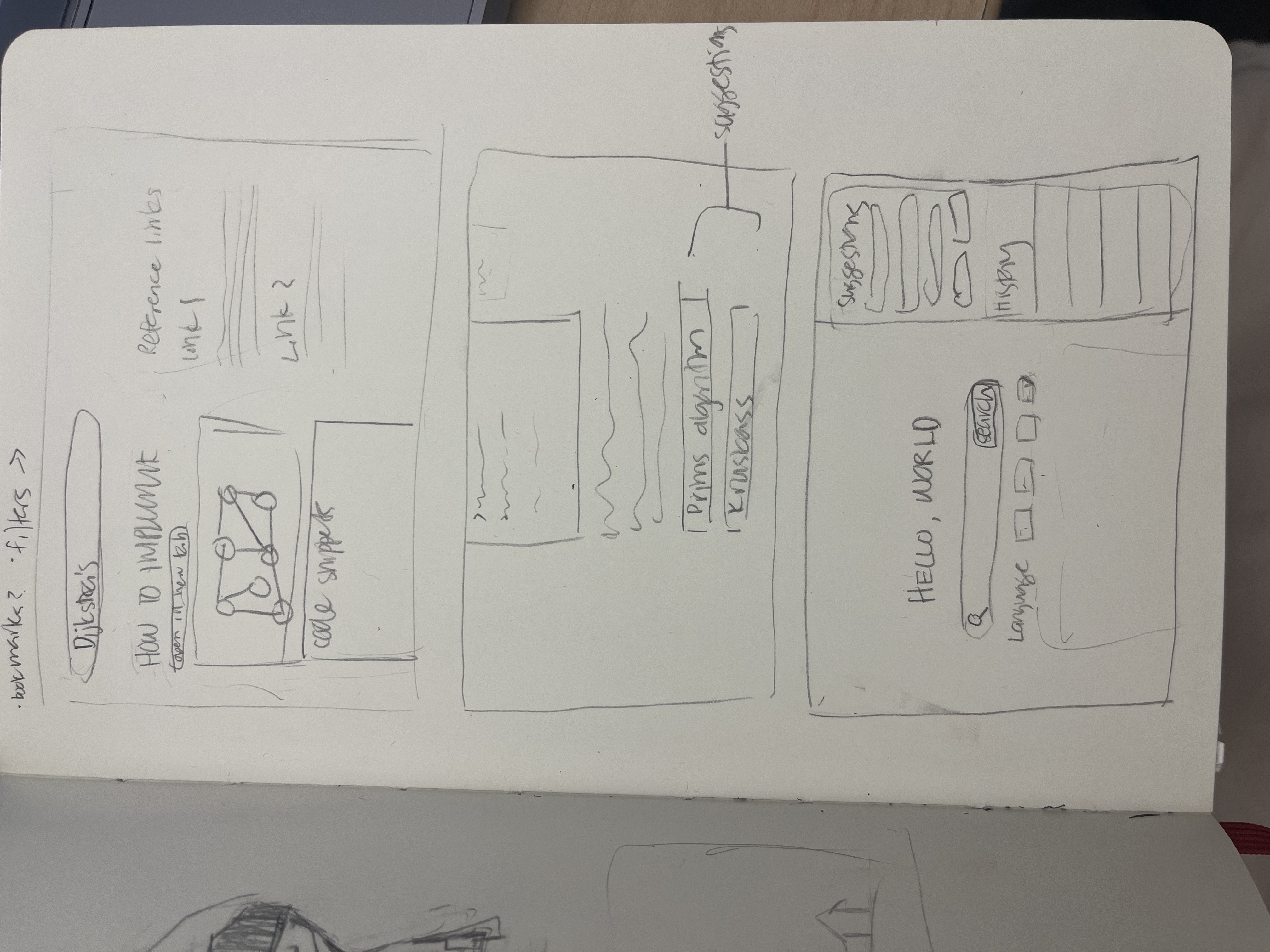
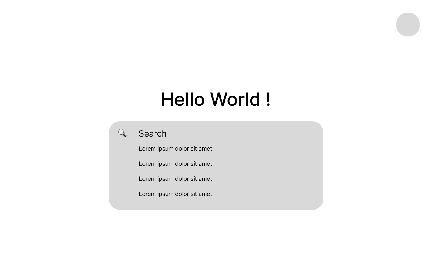
We made the following changes to our initial high-fi mockup; below, you can find the updated version (go into full screen for best experience).
We asked the users to imagine themselves as a computer science student and search for “how to implement Dijkstra’s algorithm” by following some task instructions which we have given. We asked them to verbalize their thoughts throughout the testing process. We informed them that they would not be using an actual website but instead testing an interactive mockup.
After the users completed all of the tasks, we asked them to answer some post-test questions. The questions were the following:
Here are the links to all three user testing videos:
User 1 User 2 User 3Overall, our UserTesting results were in line with our expectations. The users didn't have difficulty in completing the tasks and found our design intuitive.
Task 1: The users generally understood the layout and purpose of the website just from looking at the homepage. However, the first user mentioned that they would expect there to be a profile button, while the third user mentioned that the design seemed perfect for a developer.
Task 2: Based on the feedback given, in the future we would include more available languages in the mockup to give the idea that there would be a lot to choose from. Additionally, we could include a dropdown arrow after a language is chosen from the “see more” dropdown to show that users can change languages if they make a mistake.
Task 3: The overall consensus on searching “How to implement Dijkstra’s algorithm” was that it was very easy and intuitive. There was no confusion whatsoever associated with this task.
Task 4: Users felt that this task was also very intuitive. However, the first user did not see the need for a web answers section and found the web answers distracting, given that they would be using Hello for quick answers. They can simply use Google if they wanted web answers, so they prefer the web answers to be on the bottom of the page. On the other hand, the second and third users thought that the split screen was effective and helpful, with the third user even noting that this page was “everything I was looking for.”
Task 5: Users agreed that the web answers are easy to find. While the first user noted that they liked not having to go through Google, the second and third users preferred some differentiation from Google. The second and third users agreed that the whitespace on the screen can be utilized more, whether by making it full-screen or with more information on each search result.
Task 6: User liked the ‘Hello Answers’ more than the ‘Web Answers’. One user mentioned that the found the split screen more useful after seeing both pages. The users also mentioned that the answers generated by the algorithm including the quick answer and the code snippets met their expectations. They appreciated the minimal design of ‘Hello Answers’ page as there were no distractions. One user commented that they wished to see more answers instead of just the quick answer and they suggested that there could be a ‘see all answers’ button to view all the other answers relating to that question. One user found this page great for developers.
Task 7: All the users found going to the first referenced source link pretty intuitive and easy.
Based on this feedback, we would definitely give less space to the web results. Tt was mentioned multiple times that the main draw of the platform is the hello answers, so the web answers can be deprioritized since users can just go to Google if they wanted that.